
Process of creating a business card for Contra Services
I designed and produced branded business cards for Davian Contra, highlighting core services such as landscaping, flooring, and hardscaping.
Reinforced Davian Contra’s visual identity and messaging through strategic design of marketing collateral.
Created visually cohesive business cards that effectively communicated the company’s service offerings and brand image.
Project duration:
July 2025 to July 2025
Scroll ↓
This project involved transforming a real-world photograph into a fully illustrated scene, then incorporating it into a professionally designed business card. The goal was to create a brand identity that is approachable, memorable, and reflective of the company’s work in home improvement and landscaping.
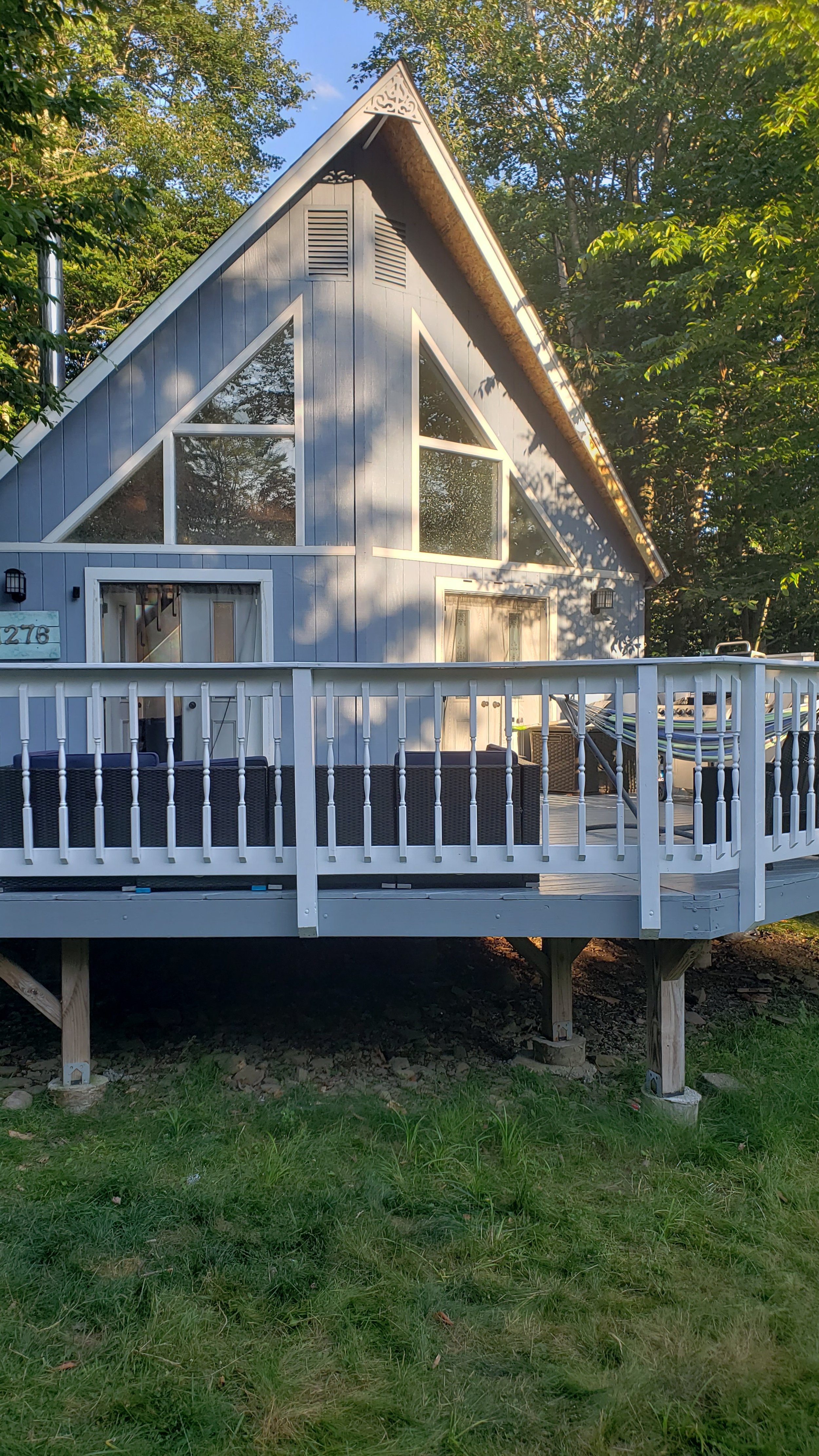
The process began with a high-resolution photograph of an A-frame cabin. This image was chosen because:
It conveys the warmth and craftsmanship associated with the brand.
It provides a versatile composition for illustration and design work.
The natural setting supports the business’s focus on outdoor and home projects.

Using digital illustration tools, the photograph was transformed through the following stages:
Line Drawing: The original photo was traced into a clean, high-contrast sketch.
Detail Enhancement: Shading and texture lines were added to convey depth.
Color Mapping: The scene was recolored to replace the cabin’s paint with warm natural wood tones and enrich the surrounding forest.
Brand-Relevant Additions: Elements such as a lawnmower, chainsaw, and a worker were added to visually represent services offered by the business.


The illustrated scene became the focal point of the card’s front side. The design integrated:
Company Logo: “Contra Services” paired with a stylized bridge icon to symbolize connection and reliability.
Tagline: “Bridging needs, Building solutions” — a concise statement of purpose.
Services List: A bullet-point summary for quick readability.
Contact Details: Name and phone number positioned for immediate visibility.


The reverse side of the card was designed for brand reinforcement and personal connection:
Logo & Tagline repeated for consistency.
Personal Introduction: A short message from the owner to convey approachability and trustworthiness.
Bold Contact Number: Centered and prominent for quick reference.
Reflection
Was the project successful?
Yes, it created a unique, memorable business card that represents the brand and stands out from generic designs.
What did I learn?
How to transform a photo into an engaging illustration and balance creativity with clear communication.
What this project says about me
I’m detail-oriented, creative, and able to turn ideas into polished, client-focused results.